Electric Letterland
Building neon GIFs in homage to the real thing
Kate Widdows is a letterer, illustrator, designer, and neon GIF maker. She’ll be sharing her thoughts and methods for building neon GIFs on Friday, June 16, in the TypeLab at Typographics. We asked Kate to prepare a sample of the kinds of content she’ll cover in her TypeLab presentation …
Among the pantheon of image file types for web, the lowly GIF format once appeared to be marked for certain death. Originally built as a super-compressed static image file, GIFs are limited to a maximum of 256 colors, and are generally unkind to gradients, subtle shadows and mixed opacities. The success of this compact, looping file format can be attributed to three things: ease of use, simple browser compatibility, and aesthetic nostalgia. No matter your pronunciation preference, today GIFs are so ubiquitous that scarcely would we recognize the landscape of our online lives without them.


Classic animated GIFs from the early web, courtesy of GifCities.
Here on terra firma, the same can be said of neon signs. This hand-bent artform has been king of the lit signage world for the last 100 years. When it comes to letterforms, these naked glass tubes filled with ignited gas are unsurpassed in terms of legibility, longevity, and beauty. Much like the once despised GIF, neon has suffered a litany of threats including energy crises, competition from other lit sign industries, and public anti-smut campaigns. But these challenges have only served to highlight neon’s uniquely captivating presence. As a form of physical advertising, neon is now either a premium level choice or an artistic statement (sometimes both). Meanwhile, vintage signs are coveted as irreplaceable relics, with the number of neon museums and preservation groups growing year by year.

The Cross Roads of the World was America’s first outdoor shopping mall, built in the 1930s in Los Angeles. This sign is situated off Sunset Boulevard on a dark, quiet street, behind the site’s sprawling collection of bungalows.
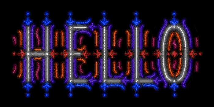
My first neon GIF, a casual attempt at neon mimicry in the digital realm, induced an abrupt awakening to the unrivaled gorgeousness of neon signs. Sprung out of a desire to practice drawing letters, making neon GIFs quickly became an obsession, fueled by an equally passionate plunge into neon history.
Like many GIF artists, I found the cut-and-paste feel of GIF-making irresistible. Neon’s restrictive simplicity – monolinearity and the impossibility of closed shapes for example – is also it’s charm. Turns out that using pixels and lighted screens to emulate blinking, glowing tubes works remarkably well: neon GIFs look damn good on devices large and small.

The Laurelhurst Theater in Portland, Oregon. Still active as a second run and arthouse theater, it was built in 1923 and boasts one of the best neon signs in town.
While sign designers must work within the limitations of budget, tube length, color palette, scale, and their client’s wishes, GIF-making is limited only to how much time one devotes to it. It’s a fun place to experiment with new styles of letterforms, or take inspiration from impressive examples found in old Vegas or post-war Poland. Tricky styles include arcs, inline letters, and marquee styles made popular in Hong Kong, where a field of flashing neon stripes or swirling linear designs surround the letters. Simple monoline scripts or humble art deco capitals are a natural fit for neon GIFs, where subtle imperfections echo neon’s hand made origins.
In the physical world, neon is too beloved to die just yet. But the fate of the GIF format is more precarious. A relatively obscure file format called APNG (an animated extension of the already-popular PNG format) appears poised to usurp GIF’s royal status on the web, boasting wider color support, unlimited framerate, and more nuanced transparency allowances. Last year Apple adapted APNG as the preferred format for animated stickers in iOS 10 iMessage apps. Organic takeover by a better quality animated format is inevitable, but until then, pixel pushers, video rippers, and photographers will continue to stretch the limits of this fun little vehicle, even if only for a laugh.
My neon GIF process goes like this …
Phase 1: Drawing

I choose a word or phrase, and draw a series of thumbnail sketches on paper, exploring lettering styles and pictorial elements.
I pick the strongest composition from my sketchbook to draw in Adobe Illustrator using the pen tool. I spend a lot of time developing strong letterforms, adding and adjusting neon-like gaps, and working towards a coherent overall composition.

After checking the design in white on a black background, I save out clean .ai files in white strokes – parsing out different parts of the design into separate files, in anticipation of future color designations.

Phase 2: Glows
In Photoshop, I start with a 1800px square canvas with a black background, and place the vector files in the document.
Working with the layers as smart objects in duplicate, I add minimums, gaussian blurs, and color overlays to create the lit version of the piece.
For the unlit version, I duplicate the layers into a separate folder, toss out the glow layers, and adjust effects to achieve a somewhat realistic tube look.
In the layer comps panel, I designate “on” and “off” states, and any other states I’m interested in using in the animation.

Phase 3: Animation & Output
To truly mimic neon’s behavior, I use the frame animation palette, where I assign layer comp states and durations to each frame.
Blinking patterns vary based on concept: some pieces are frantic and contain multiple flashing parts, while others simply blink on and off slowly. Occasionally I’ll imitate an electrical malfunction with a flickering effect.
To export, I use the “save for web and devices” option, choosing “GIF” from the format menu at the top. I like to use a 4-up preview window to compare quality. Typically my output size size is 700px or smaller, to keep the GIF within social media size limits, and for faster loading.
Photoshop’s GIF output presents some challenges for files with gradients. The more significant your “glow” layers are, the more potential there is for a stippled look. I typically check the transparency box, choose “diffusion” dither and “selective” or “perceptual” color reduction.
I make several test GIFs, and adjust the animation to arrive at something that feels like the right rhythm.
Phase 4: Uploading
GIFs can be uploaded to Twitter (5MB max on mobile, 15MB max on web) and Tumblr (3MB max) as they are, from your desktop, just like any other image format. To post your GIF on Instagram, which is restricted to mobile-only uploads, I like to use an app called InstaGif in collaboration with Dropbox. Despite the app’s inability to maintain the original rhythm and pacing of your GIF, at the moment this appears to be the simplest process with the fewest steps. Another route is to export your Photoshop file as an .mp4 or .mov, add it to Dropbox, and save the file to your camera roll from the Dropbox app.
Happy GIFing!
See Kate Widdows walk through her GIF-making process in more detail during her presentation in the TypeLab at Typographics on Friday, June 16, at 12:30pm.

